better notes / links / attachments menu

Xmind's right hand side notes / links / attachments menu is not very consistent...
For an attachment or an audio note a new child is created, for a note or a link an icon is created.
I like the notes popup and especially the topic linking is very useful to me but when you need both an icon with 3 dots is created with a preview of the note and a link alt?
This just does not look professional, it is confusing and not consistent.
Better to separate notes and links (one icon each) and the attachments and audio links should have a similar popup and icon
While we're at it, why not develop a comment feature?
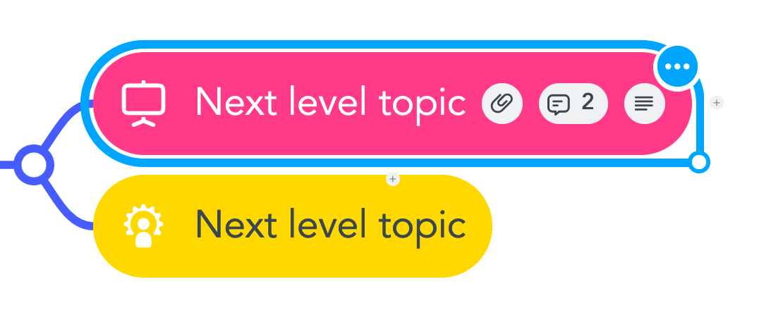
Here is how MindMeister does it:
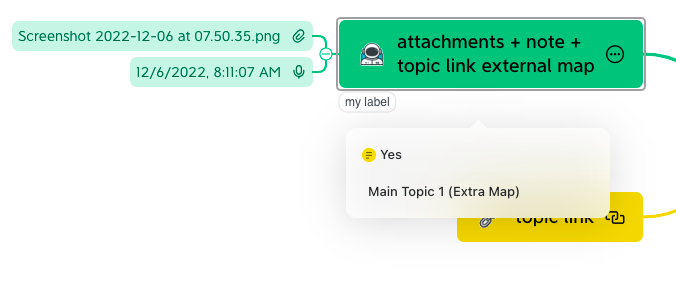
vs Xmind:
Please sign in to leave a comment.
Comments
0 comments